 Welcome, Guest Blogger
Displaying a React Native Modal box in a mobile application is a common need for mobile app developers and designers. A modal box is useful to display on-screen notifications or messages to the user. Those notifications could be successful messages, warnings, errors, or even requesting confirmation to specific actions.
In this post, we will discuss building a great React Native application demo that includes almost all modal scenarios required by React Native developers. We recommend that you clone our React Native Modal Demo public repository on GitHub to your local environment to be able to correlate the React Native modal configurations used in this post with the source code.
You can go to our GitHub Repository through this link.

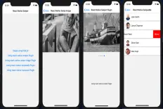
As shown in the above screenshots, the demo includes:
- Creating a React Native Modal reusable component.
- An in-depth React Native Modal style example.
- How to build a React Native Modal full screen mode.
- How to display a React Native Modal that’s not in full screen mode.
- The modifications needed to build a bottom-half React Native Modal.
- How to dismiss/close a React Native Modal on clicking outside the modal box.
- React-native-modal plugin integration.
- React-native-modals plugin integration.
Check the next animated GIF to check the behavior of the modal box that we are going to implement when the area outside the modal box is clicked.
We are going to use the React Native Modal developed by Facebook to build all the above configurations and scenarios.
Although there are several other plugins, that we will mention throughout this post and the differences between them, that accomplish the same objective but, we decided to build our React Native Modal demo app using just the built-in Modal component shipped with the ‘react-native’ library.

Creating a React Native Modal Reusable Component
In this section, we are going to build a reusable component that wraps the React Native modal component. External parent components will be able to call that reusable component and pass configuration parameters to it, in order to either change its appearance, styling and/or behavior.First, you’d need to create a brand-new React Native project. It’s important to mention that we do not use Expo when we create React Native projects. Instead, we use the classic React Native CLI commands to do that. In order to create a new React Native project, see Create a brand new React Native Project.
Second, create a new component class called CustomModal in a new directory called “components” exactly as structured in the demo repository that you cloned. The CustomModal component will act as the reusable component that the other parent screens will call.
CustomModal component’s source code can be found here. The CustomModal component is the core of this post and the demo we shared, so it’s important to focus on the building blocks of this component.First, the imports of this component are nothing more than a React Native View, Modal, StyleSheet, Dimensions and TouchableWithoutFeedback. It’s clear that CustomModal uses only the basic React Native components as shown below.
render() function of this component looks like the following code:Here are some important notes on the
render() function of the CustomModal:- You’d notice that the return statement wraps a
TouchableWithoutFeedbackcomponent inside the React Native Modal component, which wraps three nested views that finally wrapthis.props.childrenwhich means any components that will be passed between the opening and the closing tags of theCustomModalwill be rendered inside the modal. For example:
CustomModal and displayed on the screen inside the modal box.- The Modal component exposes four properties to be used as custom configurations by the external calling components. Those four properties are:
this.props.animation- which is passed to the Modal’s animationType property. As mentioned by Facebook, there are 3 types of animations allowed:none,slideandfade.this.props.transparentContainer- which is passed to the Modal’s transparent property. If it’s set to true, the Modal box will show above the calling screen with an elevation.this.props.visible- which is also passed to the Modal’s visible property.this.props.mode- which is passed to the presentationStyle property of the Modal component. There are four allowed presentation styles:fullScreen,pageSheet,formSheetandoverFullScreen. In this post, we’re going to useoverFullScreenonly.
React Native Modal Style Example
In the previous code snippets, you should have noticed a great React Native Modal style example that the CustomModal uses a wrapper class called StyleSheetFactory, which is an internal class that wraps the styles used in the CustomModal.
StyleSheetFactory internal class is used to do nothing but to connect the props sent from the calling parent component to the styles, for example:
this.props.boxBackgroundColor: will be used to change the background color of the modal box.this.props.fullscreen: will be used to either display the modal box in full screen mode or not.this.props.bottomHalf: will be used to either display the modal box in the bottom half of the screen or not.
A full overview of the StyleSheetFactory class is like the following code snippet:
Basically, StyleSheetFactory will change the styling of the CustomModal based on the passed parameters: boxBgColor, fullscreen, bottomHalf and modalHeight.
React Native Modal Full Screen
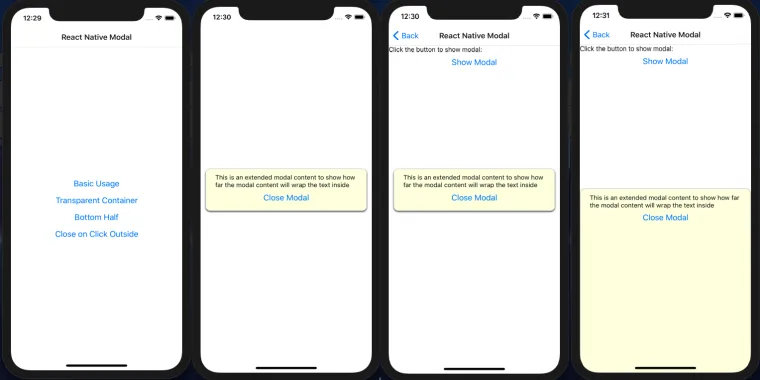
The first example to using the reusable custom component CustomModal is opening the modal box in full screen.
In the React Native Modal full screen demo, we used React Navigation in order to use only a single screen, then pass different navigation parameters to that screen.
A new screen is created called BasicScreen.js. This screen will host the CustomModal and pass all the required configurations using the navigation parameters.
Those navigation parameters will act as the CustomModal configurations.
As shown in the previous snippet, if the navigation parameter transparent is passed as true, then the modal will pop over the sender screen and you can see the background screen behind the modal box.
Otherwise, the whole screen will act as the modal box without a transparent background as shown below.
Setting the transparent navigation parameter to false, will let the screen to show the modal box as follows:

Notice that, the more content is placed inside the modal box, the more height the box will gain and show across the full screen.
The CustomModal hosted inside the BasicScreen should look like the following code snippet:
To dismiss the modal box, we leverage the use of local states which controls the visible property of the CustomModal. The modalVisible state property toggling is handled by the “Close Modal” button placed as a child component inside the CustomModal and the “Show Modal” button placed in BasicScreen.
“Show Modal” will set the state variable to true, while “Close Modal” will set it to false.
React Native Modal Not in Full Screen Mode
This behavior is the opposite configuration of the full screen mode. Simply if the transparent navigation parameter is set to true. The background screen will start to show and the modal will appear as a popover above it as shown in the below screenshot:

The idea is that the React Native Modal component uses a background view to the modal box. Then, it decides to set the background color to either white or transparent based on the boolean property “transparent” being set as true or false.
That’s why we delegated that property in CustomModal to another boolean property called transparentContainer to be less confusing.
Bottom-Half React Native Modal
Showing a React Native Modal in the bottom-half section of the screen with our setup is beyond simple. You could have already noticed that there is a boolean property inside CustomModal called bottomHalf that could be set to true or false to show the modal in the bottom-half mode.

Note: If you set the CustomModal fullscreen and the bottomHalf properties together as true. The fullscreen property will take higher precedence and the modal will show in fullscreen mode.
The idea showing the modal in the bottom-half section depends on obtaining the screen height using the Dimensions component shipped with React Native.
Basically, it sets the modal’s wrapper height and its top margin to half of the screen height. Check the StyleSheetFactory internal class in CustomModal for more details.
Closing the React Native Modal on Clicking Outside
The work-around to close the React Native Modal on clicking outside is to simple wrap all the Modal children components into a TouchableWithoutFeedback component.
The TouchableWithoutFeedback is actually a button that has no appearance and does not give any feedback when clicked. Other examples of the touchable buttons is the TouchableOpacity and TouchableHighlight.
Then, CustomModal delegates the click event of the touchable to the calling parent components that will then, decide to do some action if the touchable is clicked. This action, in our case, will be setting the visible local state to false in BasicScreen.

Other React Native Modal Plugins
As noticed, we could accomplish almost all the basic required scenarios showing the React Native Modal. If any other different use case is required, it would be just a slight modification to our CustomModal.
However, there are other useful React Native modal plugins that took the extra mile for you like:
- React-native-modal: that provides some extra cool features like more animations, flexible APIs, timing, device orientation friendliness, swiping and scrolling and more.
- React-native-modals: just like the previous plugin but highly customizable, swipe-able, and supports multiple modes and custom animations.
We found both plugins interesting, and we added some useful examples how to include them and call them in your project. As we know, some plugins have always advantages over the others and what we found through integrating both plugins is very interesting.

When it comes to the popularity of both React Native modal plugins, we found that the react-native-modal is more popular and established than react-native-modals.
Here’s a chart that emphasizes the popularity difference:

It appears that the react-native-modals plugin is not as popular as the react-native-modal plugin. But, we recommend that you continue reading to check the interesting results of integrating both plugins to show some modals on a mobile application.
React-Native-Modal Integration Results
To add the react-native-modal plugin to your project, just run the one of the following commands depending on which package manager tool you’re using in your project:
yarn add react-native-modal or npm i react-native-modal
The next step is to import the plugin using the following import statement:
The next step is calling the modal plugin you’ve just imported in order to display a modal on the screen.
As noticed in the above code snippet, it’s worthy mentioning the advantages and disadvantages of using this plugin over the native Modal component shipped with React Native.
Let’s start with the advantages:
- The
react-native-modalplugin actually uses theModalplugin shipped with React Native as mentioned in the usage section in the plugin documentation. - The plugin allows both full-screen and a non-full-screen modes out of the box using the
coverScreenproperty. - It also provides a way to dismiss the modal when a click is tapped outside the modal box. In other words, a backdrop press, using the
onBackdropPresscallback. - Not only those previously mentioned behaviors, but also it allows swiping the modal to a direction (up, left, bottom, right) and provides a nice
onSwipeCompletecallback to handle the swiping event. Such a great tool.
- There’s a reported issue, that appears to be closed by the time of this writing, that the modal flashes strangely when it animates on the screen due to setting the “
useNativeDriver” property to true. But we found that the modal still flashes the same described way without using this property. It flashes/blinks when you just close the modal as shown in the screenshot below. - This plugin does not provide a way to display the modal at the bottom-half of the screen as commonly required by most React Native developers.

React-Native-Modals Integration Results
You can install react-native-modals plugin the same way with react-native-modal. Using yarn or npm.
The following imports might be needed according to your requirements.
To call the modal component, you can place the following code snippet in your project as a simple example:
The advantages of this plugin are:- It provides an out-of-the-box callback called “
onTouchOutside” to handle the modal visibility if the user tapped outside the modal box area. - It adds multiple swipe directions using the “
swipeDirections” property in addition to a callback called “onSwipeOut” to handle the modal visibility if the user swiped out the modal to any of the available configured directions. - The plugin also allows a separate animation setup that can be used to either configure any of the default animations or configure a custom animation. In the above example,
SlideAnimationbuilt-in class is used to slide the modal from the bottom. - Last but not least, the plugin provides an out-of-the-box setup to show the modal at the bottom-half of the screen.

As noticed, despite the less popularity of the
react-native-modals plugin, it transcends react-native-modal by several advantages like the extensive animation setup and the bottom-half-screen setup.As a Conclusion
The most common ways to add a React Native modal to your app are either the Modal component shipped with React Native, the react-native-modal plugin or the react-native-modals plugin.
The most popular plugin used is react-native-modal. However, it will leave you with some issues that you may need to handle on your own.
Otherwise, you can use either the Modal component built in React Native or the react-native-modals component that handles everything for you without any issues.
Summary
There are countless ways to show a great React Native Modal box in a mobile application.
It depends on the compatibility of your app project to decide to use the Modal component shipped with React Native, and that case placing the CustomModal component discussed in this post into your React Native project will let you handle most of the basic cases needed for a React Native Modal, or use one of the external plugins to do the job for you.
If you have any comment or issue, please, do not hesitate to drop a comment. We will be happy helping!
Read Next
The following articles are related to react native modal box - everything you need to know.